Artwork Design Guide

Not all digital designs are created equally. Some files are simply higher quality than others, and some sellers run into issues uploading subpar images for product designs. We’re going to cover the basics of artwork design to ensure crystal clear print quality on all of your products and, most importantly, to keep customers happy.
More design guides:
Free Artwork Gallery
If you'd like to make some tests before uploading your own designs, you can access here to download free artwork to help you create your first campaign.
Artwork Requirements
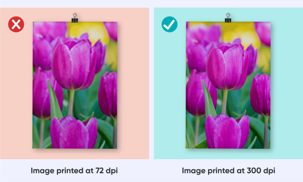
It can be tricky to determine whether a graphic piece of artwork is of high enough quality to hit the printing press. Luckily, we’ve devised a simple rule of thumb to follow: Keep a close eye on your graphic’s dots per inch (resolution/ DPI). Anywhere near the 300 mark is ideal and 120 is the minimal acceptable limit.
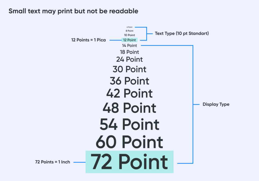
Text size is also another common pitfall among designs. If it’s too small, it will appear illegible and unclear in the printing process which will disappoint customers. 10 points (13 pixels) is the minimum acceptable text size. Here’s a technical tidbit to experiment within the photo editor: Before exporting your design, turn off the “anti-aliasing” feature to improve clarity around the borders of the image.
As far as color schemes, we recommend the RGB color wheel for your designs. The CMYK color wheel is also another option if you prioritize color accuracy and vibrancy. Avoid using JPEG images, and stick to PNG images with a transparent background for the best possible image resolution with a maximum 50MB file size.
Here are some examples of low-quality artwork for reference:
1. Low resolution text
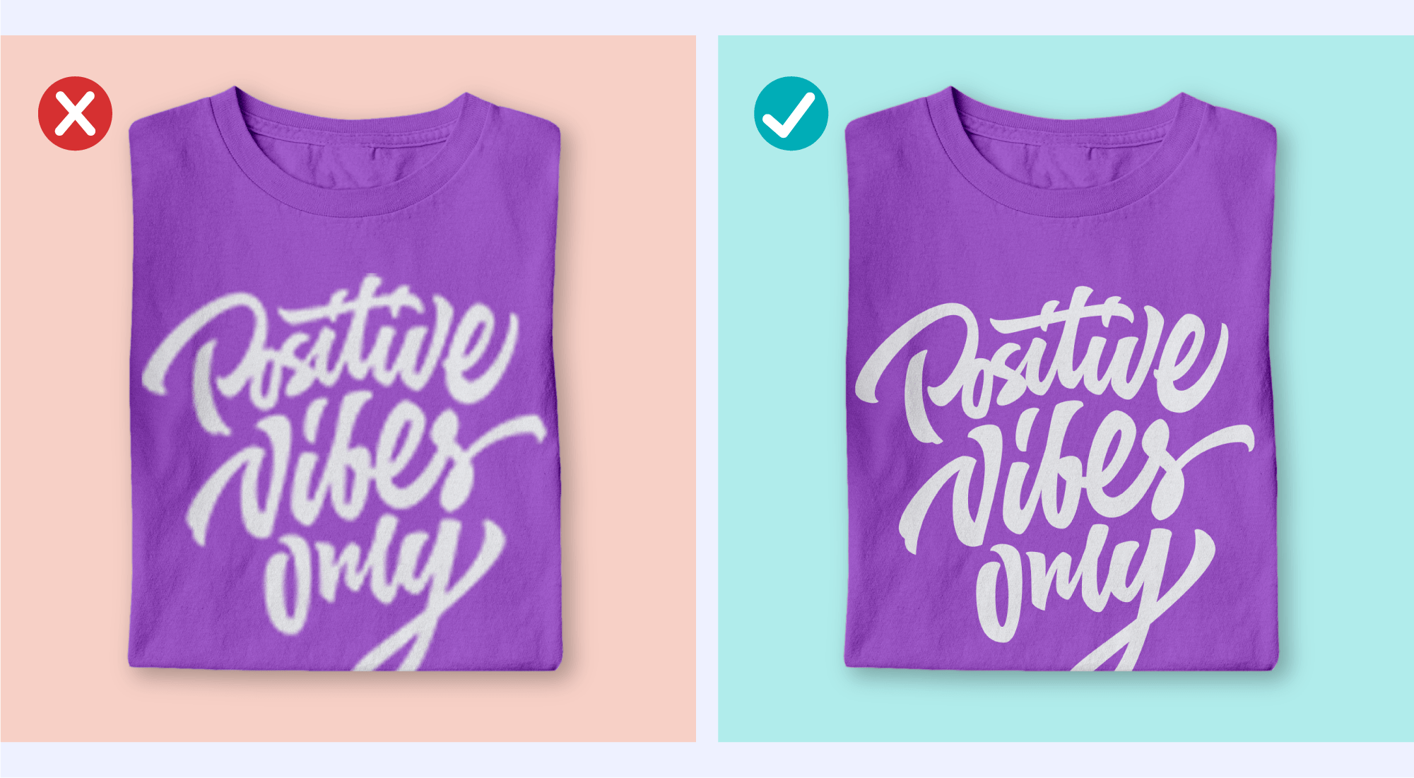
2. Low-resolution image (blurry/out-of-focus)
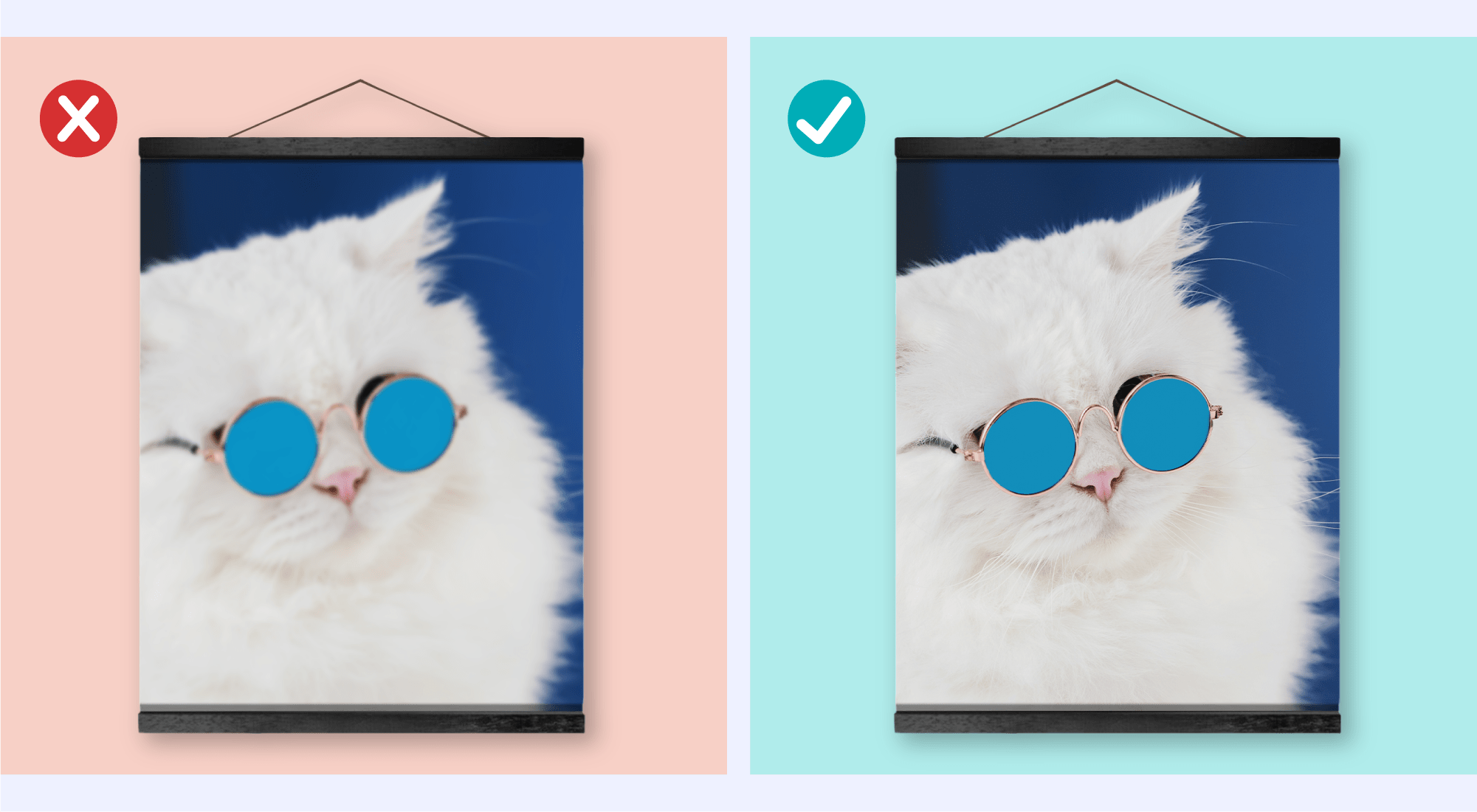
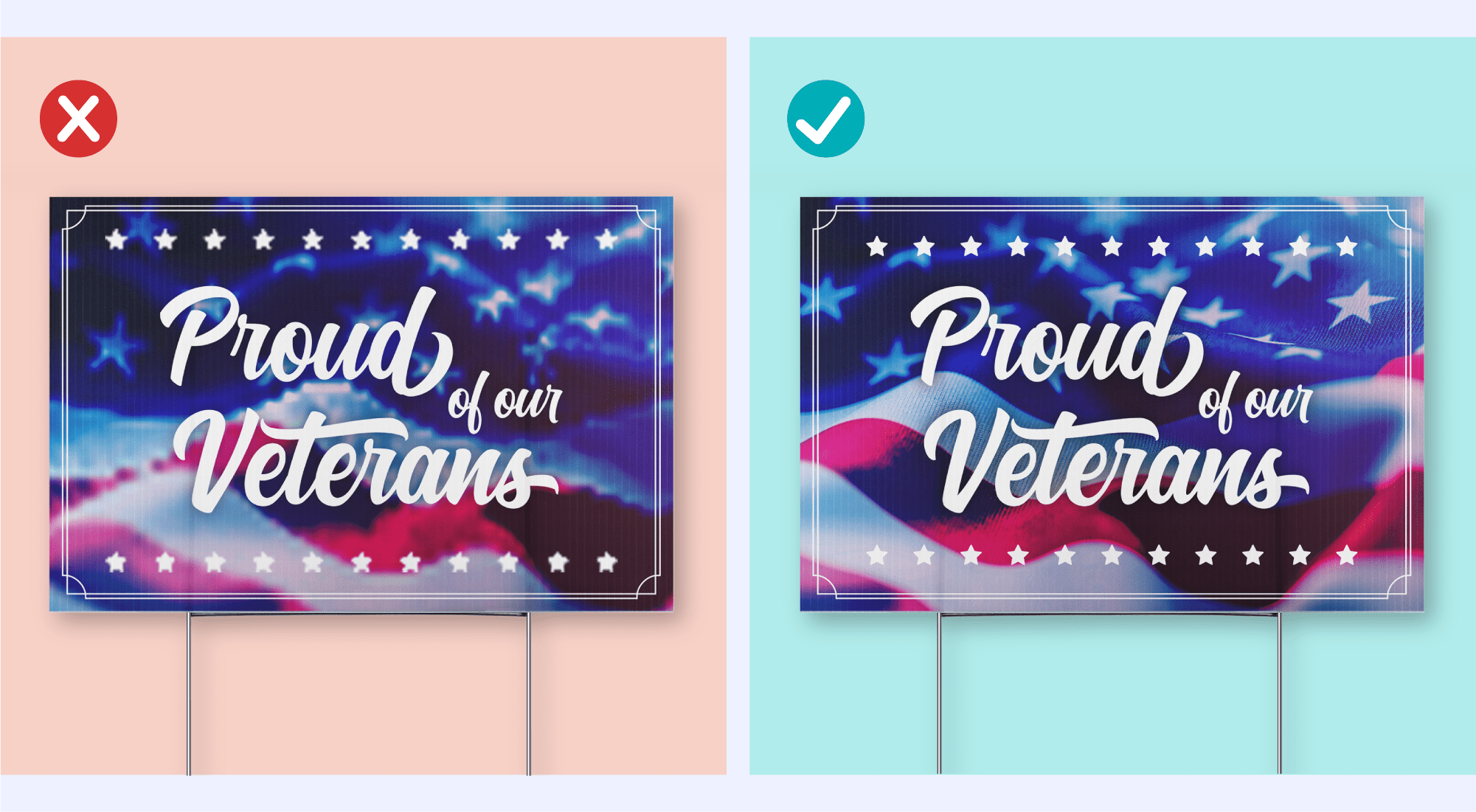
3. Low-resolution text and image
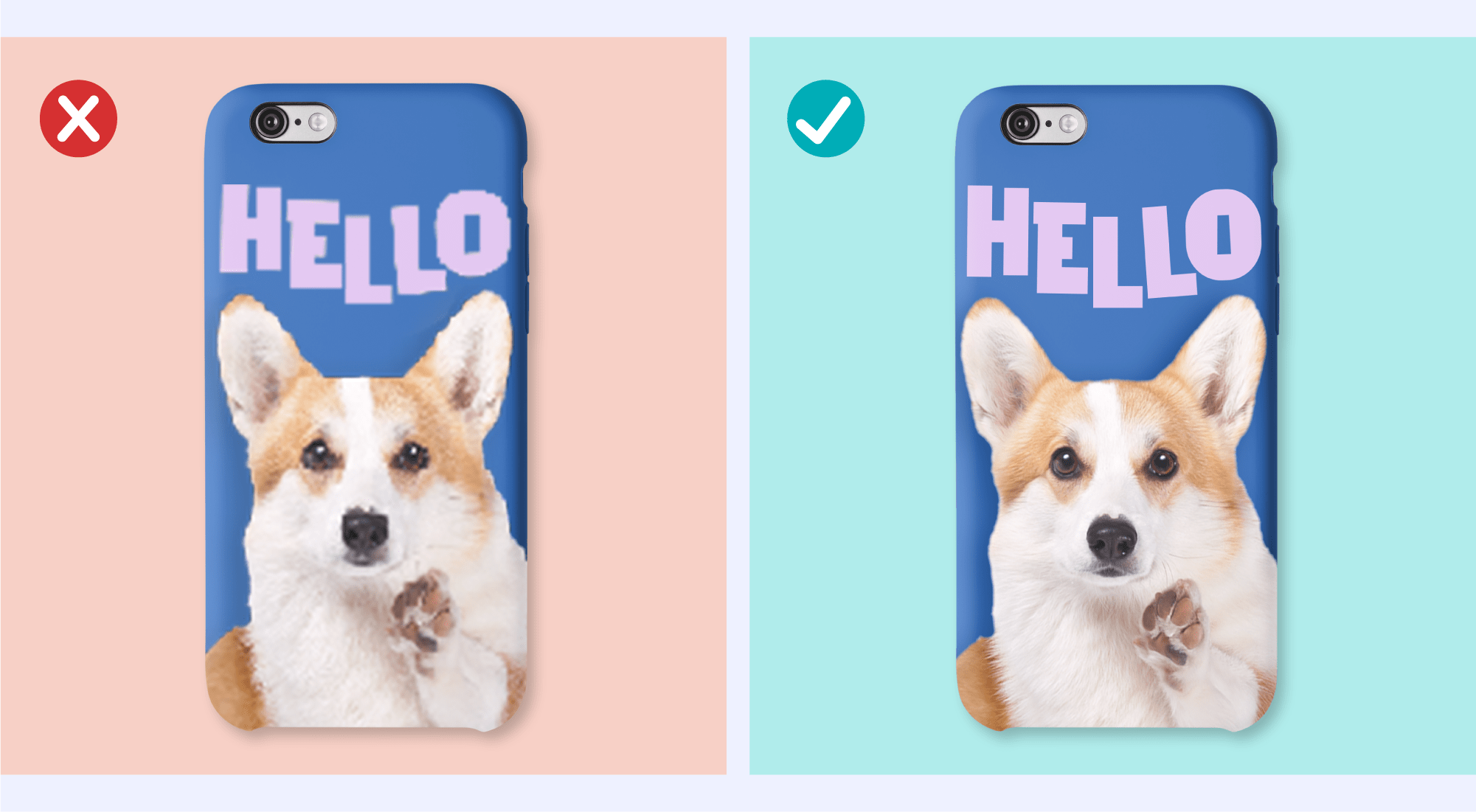
4. High-resolution text but low-resolution image
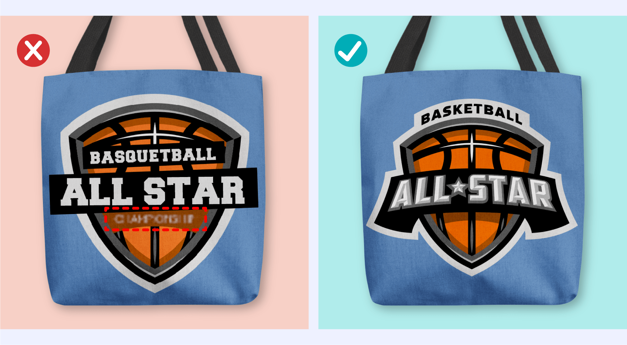
5. High-resolution artwork with blurry text or patches
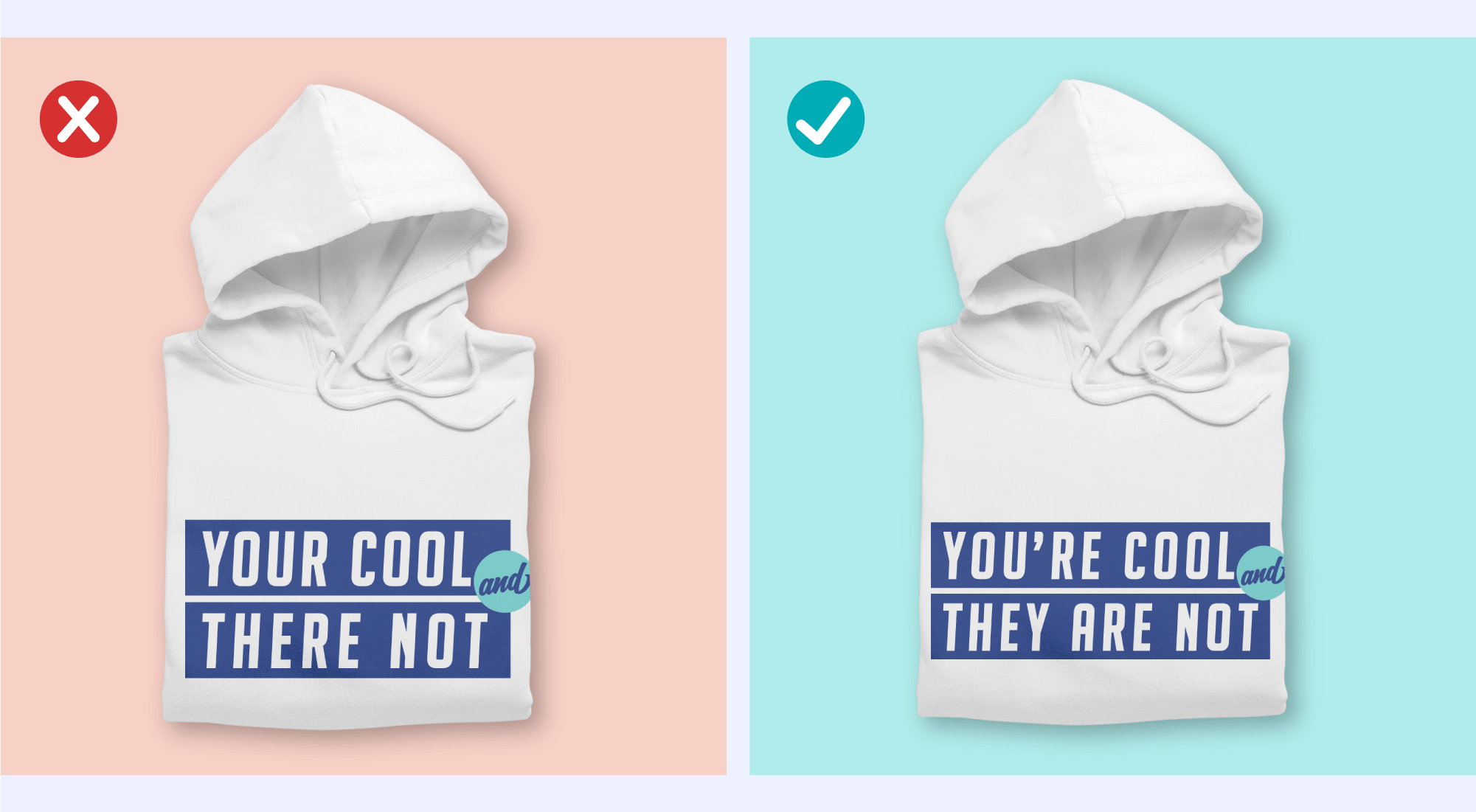
6. Artwork with typos
Use free online tools like Grammarly, Hemingway, and Scribens to spell-check the text before uploading your artwork.
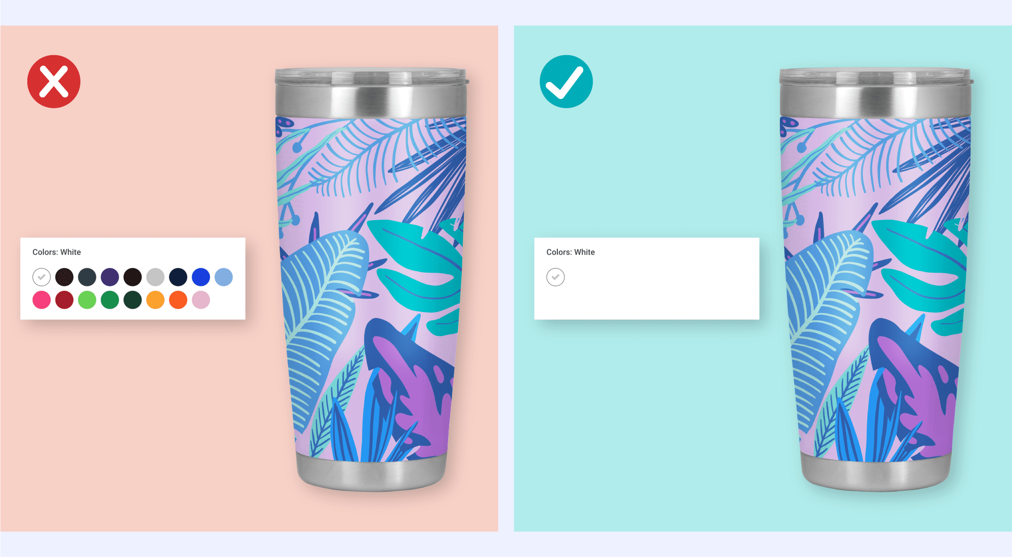
7. Offering multiple color options to all-over-print products
Remember All-Over-Print products’ artwork covers the whole product. It’s very important to remember it will always be printed on a white background regardless of color offerings.
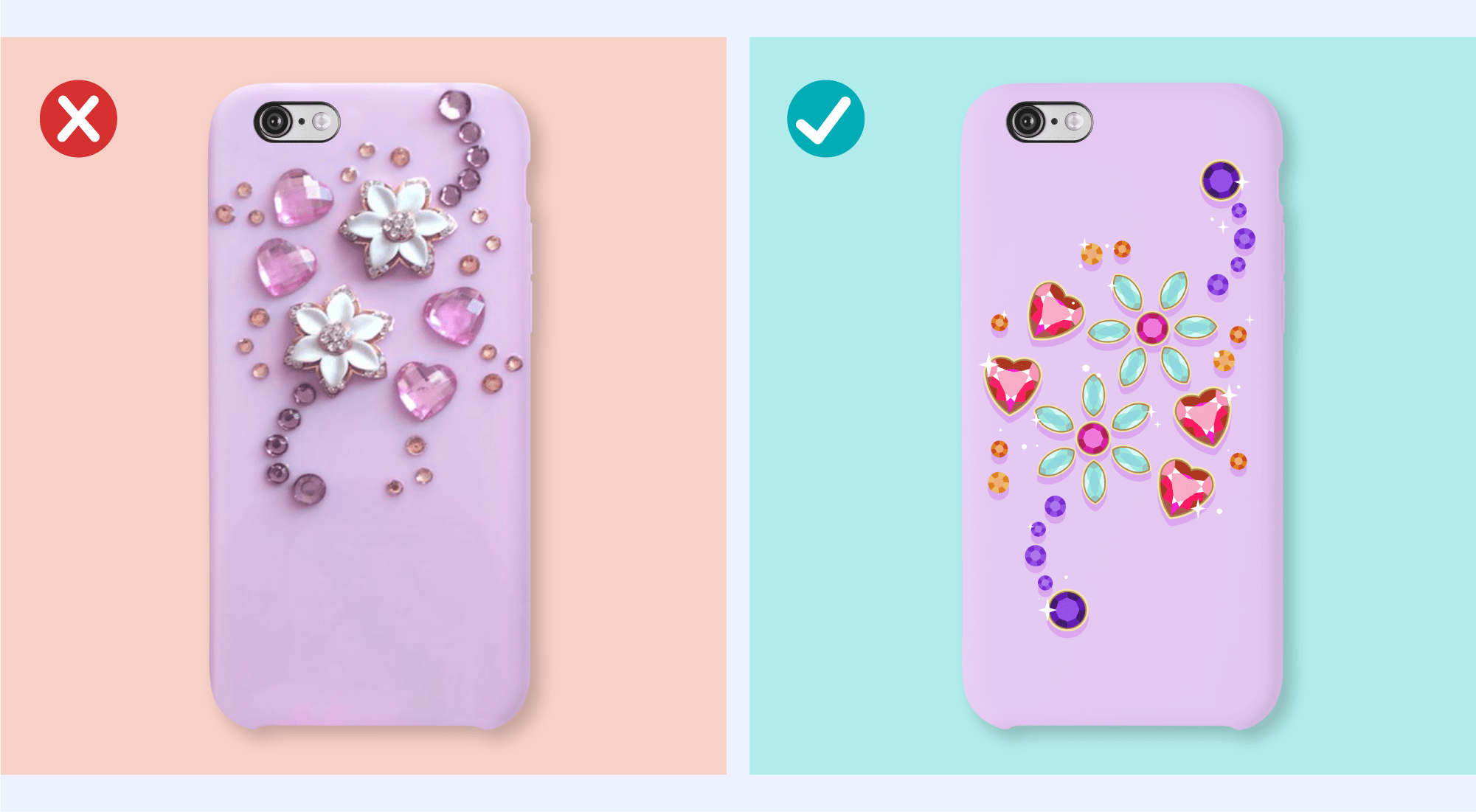
8. Gold, silver, and crystal-like designs
These types of designs may confuse your customers, as they may think their product will have real gold, silver, or crystals instead of being a print. Try illustrations instead.
Design Templates
Creativity is key, but keep in mind that certain designs need to be altered depending on where or what it’s going to be printed on. Make sure to use our design templates that will help eliminate most of the tricky guesswork involved in devising proportional designs for all of your products.
Find more selling guides of other products here.
If you’re still unsure about artwork quality requirements, be sure to contact our team for step-by-step guidance on improving your artwork and boosting sales.
